Edo Pop: Japanese Prints 1825-1895
Edo Pop: Japanese Prints 1825–1895 opened with an exhibition design shaped to feel welcoming, lively, and contemporary, while honouring the rich history of the artworks on display.
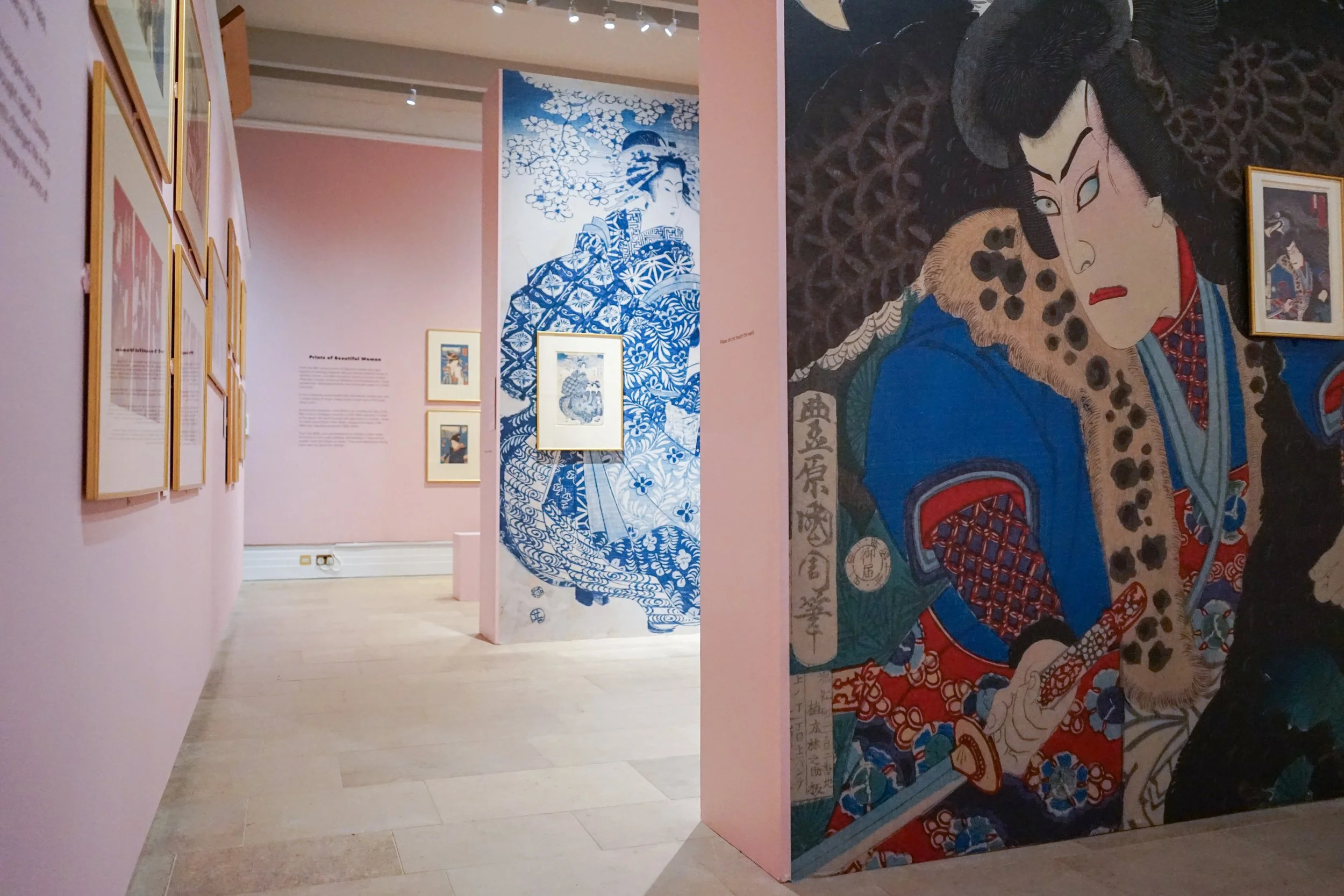
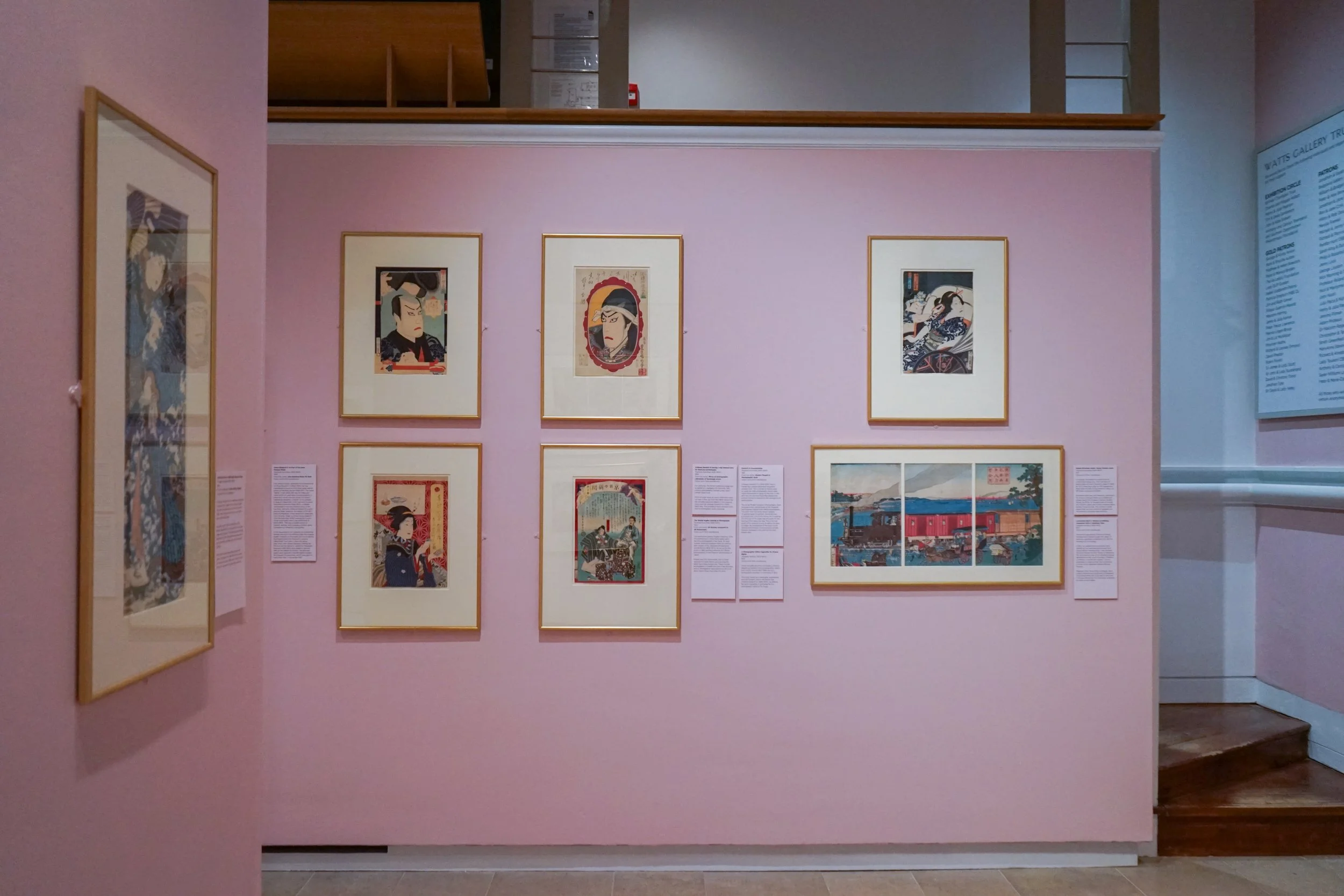
The show featured more than 60 prints, and the limited space called for careful planning. Working with Graham Bowerwood productions, I introduced two false walls to increase the display area and guide visitors smoothly through the gallery.
Inspired by the cherry blossom seen throughout the prints, I selected a soft blush pink for the walls. Using colour theory, this hue was chosen for its links to spring, youth, and joy, helping to create a calm and uplifting setting. I worked with Little Greene, who sponsored the exhibition and supplied the Confetti paint that brought this vision to life.
The chosen typeface, Shorai Sans, balanced gentle hand-drawn influence with clean geometric lines. Its name comes from a term meaning “the sound of wind through pine trees,” reflecting its blend of tradition and modern design.
Although Japanese woodblock prints are often linked with landscapes, Edo Pop placed its focus on people and their stories. To support this, I worked with Headline Print to produce large-scale vinyl graphics that highlighted key figures from the prints.
Exhibition trailer
I worked closely with animator Sarah Hoyle to create a striking promotional trailer that helped bring the exhibition to a wider audience.